

Deploy Keras neural network to Flask web service | Part 7 - Visualizations with D3, DC, Crossfilter
text
Data visualization with DC and Crossfilter
In this episode, we'll see how we can visualize the prediction results from our neural network with charts in our front end web application using the DC and Crossfilter Javascript APIs.

In the last couple of episodes, we completed the development of the back end Flask web service to host our Keras model, as well as the front end web application to interact with our model and request predictions for images of cats and dogs.
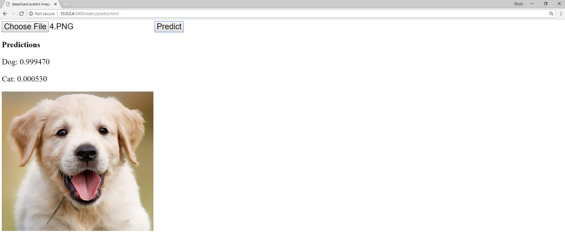
Previously, we saw that our model would return predictions to us, and then we displayed the values of the predictions on the page.
Now, rather than just displaying the raw prediction values, we're going to see how we can visualize these predictions using charts.
Data visualization is a big deal in general, so quickly getting an idea for how this may be done in this application can help you kick start the process of thinking about how you may want to visualize data across other apps going forward.
This is what our visualizations will look like.
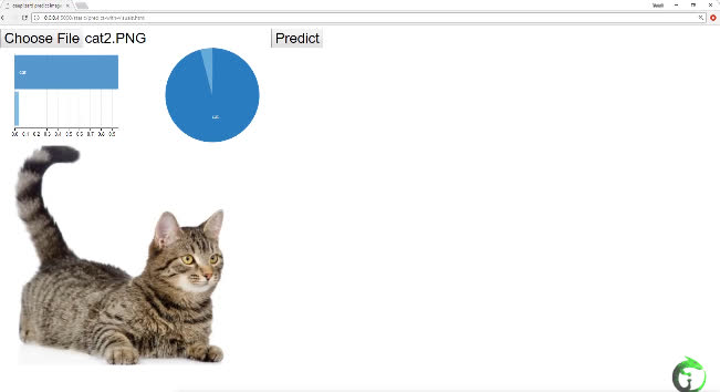
Here, we have a row chart and a pie chart both depicting the predictions for this image. Additionally, hovering over the graphs will give us the corresponding values for each category.
Implement data visualizations in code
Let's see how we can get this set up now.
From the static directory within flask_apps, create a new file called predict-with-visuals.html.
Within this file, we'll add some modifications from the original application we've built over the last couple of episodes.
Most of the code will be the exact same as it was in the last episode, since the only functionality that we're modifying is, rather than displaying the values for the predictions on screen with text after clicking the Predict button, we're now displaying charts.
Given this, we'll only go over the new additions and changes to the existing code.
The first thing that's new is within the head of the HTML.
<head>
    <title>deeplizard predict image app</title>
    <link rel="stylesheet" href="https://cdnjs.cloudflare.com/ajax/libs/dc/3.0.4/dc.css">
    <style>
        * { font-size:30px; }
    </style>
</head>
We're importing a particular style for the charts on our page with a link to a dc.css file.
Next, within the body below the predict button, we now have a new div tag that contains two embedded divs, which are just divisions on our HTML document
to hold the row chart and the pie chart.
<body>
    <input id="image-selector" type="file">
    <button id="predict-button">Predict</button>
    <div>
        <div id="row-chart"></div>
        <div id="pie-chart"></div>
    </div>
    <img id="selected-image" style="clear:both;display:block;"  src=""/>
    ...

</body>
Additionally, in the body, we also have a change to the img element. Recall this is the element that displays the selected image on the screen. To this element, we add a
style to it so that the image will be displayed underneath the charts, rather than next to them.
That's all that is new in regards to the UI portion.
Next, still within the body, we have three new script tags. One that imports D3, one that imports Crossfilter, and one that imports DC. These are all the Javascript libraries we'll
use to create the charts.
<script src="https://d3js.org/d3.v5.min.js"></script>
<script src="https://cdnjs.cloudflare.com/ajax/libs/crossfilter/1.3.12/crossfilter.min.js"></script>
<script src="https://cdnjs.cloudflare.com/ajax/libs/dc/3.0.3/dc.min.js"></script>
D3 is a data visualization API. The Crossfilter API provides ways to interact with and explore data sets in the browser. DC is a higher level API built on top of D3 and crossfilter. We'll be making use of all three of these libraries when we create and plot our charts.
Now, within the handler that specifies what to do once an image is selected from the file selector, rather than clearing the dog and cat prediction text that we were previously displaying on the page like we were before, instead we now clear the contents of the divs that hold the charts.
$("#image-selector").change(function() {
    ...
    }
    reader.readAsDataURL($("#image-selector")[0].files[0]);
    $("#row-chart").empty();
    $("#pie-chart").empty();
});
This will remove the charts from the screen before a prediction for a new image is requested.
The final changes to the code are for what happens when the predict button is clicked.
Moving inside the event handler for the click event on the predict button, after we make a post request to our predict endpoint, we create a predictions variable and transform the response from the endpoint in the following way.
$("#predict-button").click(function(){
    let message = {
        image: base64Image
    }
    console.log(message);
    $.post("http://10.0.0.4:5000/predict", JSON.stringify(message), function(response){

        let predictions = Object.entries(response.prediction).map(function(entry) {
            return {
                category: entry[0],
                value: entry[1]
            };
        });

        console.log("response.prediction originally looks like this:")
        console.log(response.prediction)
        console.log("response.prediction is then transformed to the predictions object, " +
                    "which looks like this:")
        console.log(predictions)

        let cf = crossfilter(predictions);
        let category = cf.dimension(p => p.category);

        dc.rowChart("#row-chart")
            .dimension(category)
            .group(category.group().reduceSum(p => p.value))

        dc.pieChart("#pie-chart")
            .dimension(category)
            .group(category.group().reduceSum(p => p.value))

        dc.renderAll();
    });
});
We'll disect this block of code line by line.
First, remember that the response contains a JSON object called prediction, which contains two key-value pairs containing the cat and dog predictions.
We need to process this response to get the data in a format that's suitable for Crossfilter to work with. So, we create an array of Javascript objects called predictions.
We define each Javascript object within the array to contain a category and a value. The category will be cat or dog, and the
value will be the prediction for the corresponding category.
These categories and values are extracted from the response we got from our endpoint, and the predictions array is the data set we'll be working with to plot our charts.
If you're not quite able to visualize the transformation from the response to the new predictions data set, then check out the log messages in the Javascript
console in the browser after clicking the predict button. I've logged a comparison of the two objects there so that you can view the differences for yourself.
Next, we create a crossfilter object using the predictions data set. We want our charts to be plotted by category, cats and dogs. We define cateogory as
the crossfilter dimension we want to plot against.
Using DC, we create a row chart within the row-chart div we created earlier. We specify what dimension we want to use for this chart by passing the category we just created to the dimension function.
Then, we specify what values we want plotted by calling the group() function and specifying the prediction values from our predictions data set.
We then do everything the exact same for our pie chart, and call dc.renderAll() to render the charts.
There you have it! That's how you can quickly add data visualizations to your application. While this particular data visualization was pretty basic, note that you can do a lot more with DC and Crossfilter than what we showed here. See ya in the next one!
quiz
 DEEPLIZARD
Message
DEEPLIZARD
Message
resources
updates
Committed by on