Visualizing Convolutional Filters from a CNN
text
Visualizing convolutional filters
In this post, we're going to discuss how to visualize the convolutional filters from a convolutional neural network so that we can better understand how these networks learn.
To do this, we're going to build on some ideas and concepts that we covered in our previous post on convolutional neural networks.
In that post, we discussed how each convolutional layer has some set number of filters and that these filters are what actually detect patterns in the given input. We explained technically how this works, and then at the end of the post, we looked at some filters from a CNN and observed what they were able to detect from real world images.
Keras and the code
We're going to be using Keras, a neural network API, to visualize the filters of the convolutional layers from the VGG16 network. We've talked about VGG16 previously in the Keras series, but in short, VGG16 is a CNN that won the ImageNet competition in 2014. This is a competition where teams build algorithms to compete on visual recognition tasks.
Most of the code we'll be using to visualize the filters comes from the blog, How convolutional neural networks see the world, by the creator of Keras, François Chollet.
Rather than going over the code line-by-line, we're going to instead give a high-level overview of what the code is doing, and then we'll get to the visualization piece. This github link contains the original code from the blog so you can check it out or run it yourself.
The first step is to import the pre-trained VGG16 model.
# build the VGG16 network with ImageNet weights
model = vgg16.VGG16(weights='imagenet', include_top=False)
Then we define a loss function that has an objective to maximize the activation of a given filter within a given layer. We then calculate gradient ascent with regard to our filter's activation loss.
# we build a loss function that maximizes the activation
# of the nth filter of the layer considered
layer_output = layer_dict[layer_name].output
if K.image_data_format() == 'channels_first':
    loss = K.mean(layer_output[:, filter_index, :, :])
else:
    loss = K.mean(layer_output[:, :, :, filter_index])

# we compute the gradient of the input picture wrt this loss
grads = K.gradients(loss, input_img)[0]
Note that gradient ascent is the same thing as gradient descent, except for rather than trying to minimize our loss, we're trying to maximize it.
We can think of the purpose of maximizing our loss here as basically trying to activate the filter as much as possible in order for us to be able to visually inspect what types of patterns the filter is detecting.
We then pass the network a plain gray image with some random noise as input.
# we start from a gray image with some random noise
if K.image_data_format() == 'channels_first':
    input_img_data = np.random.random((1, 3, img_width, img_height))
else:
    input_img_data = np.random.random((1, img_width, img_height, 3))
input_img_data = (input_img_data - 0.5) * 20 + 128
After we maximize the loss, we're then able to obtain a visual representation of what sort of input maximizes the activation for each filter in each layer.
# save the result to disk
save_img('stitched_filters_%dx%d.png' % (n, n), stitched_filters)
This is generated from the original gray image that we supplied the network.
To run this code, it did take a bit of time running on a CPU. Maybe about an hour to generate all of the visualizations.
That's a summary of what our code is actually doing. Now, let's get to the cool part and step through some of these generated visualizations from each convolutional layer.
Generated CNN layer visualizations
Here, we're looking at 25 filters from the first convolutional layer in the first convolutional block of the network. It looks like most of these have encoded some type of direction or color.
1st conv layer from the 1st conv block
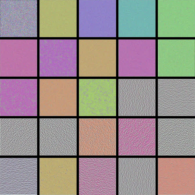
We can see some that indicate the vertical patterns and others that that indicate left and right diagonal patterns.
Let's skip to another deeper convolutional layer. We'll choose the second conv layer from the second conv block.
2nd conv layer from the 2nd conv block
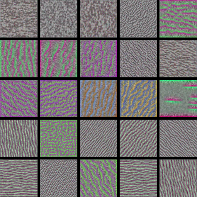
Here, these visualizations have become more complex and a little more interesting in regards to what types of patterns some of the filters have encoded.
Let's check out some even deeper layers.
2nd conv layer from the 3rd conv block
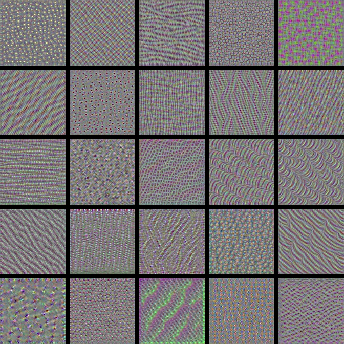
3rd conv layer from 4th conv block
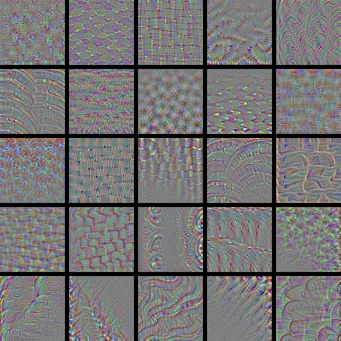
2nd conv layer from 5th conv block
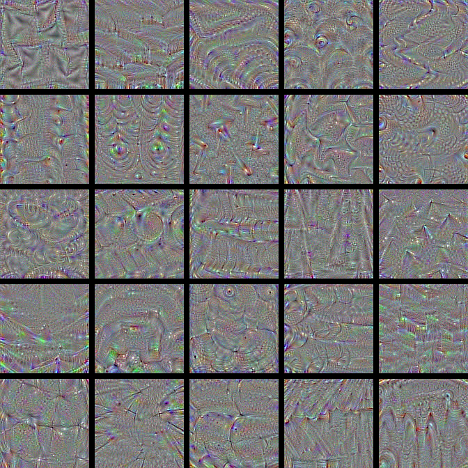
Notice how with each deeper convolutional layer, we're getting more complex and more interesting visualizations. This whole visualization process was pretty fascinating for me when I first observed it, so I hope you think it's just as cool!
Recall, in the last post, we showed the visualization of these filters on the left relative to the input images on the right.
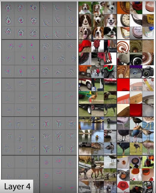
Let's focus on the one of dog faces at the top. Recall that none of the filter visualizations we just observed gave us anything that looked remotely like an actual real world object. Instead, we just saw those cool patterns.
Why is this? Why didn't we see things like dog faces? Well, recall, what we were previously observing was visual representation of what sort of input would maximize the activation for any given filter.
Here, what we're looking at is the patterns that a given filter was able to detect on specific image input for which the filter was highly activated. I just wanted to touch on the differences between those two illustrations.
Wrapping up
We should now have a better understanding of CNNs now after visualizing the filters. I'll see you in the next one!
quiz
resources
updates
Committed by on


 DEEPLIZARD
Message